
Raindrop on 26
Brand Design | 2023
Brand redesign for a massage and wellness studio in Loxton, Riverland.
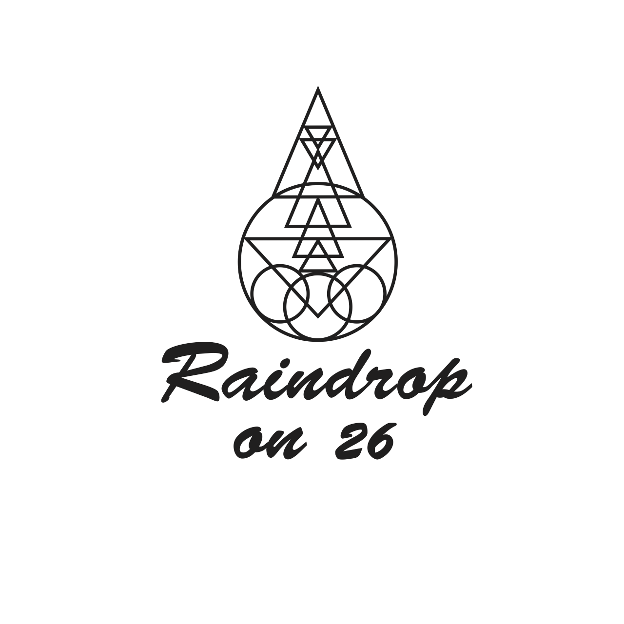
Previous Logo

THE BRIEF:
To design an elevated look to roll out with the new location. A brand with healing and natural qualities.
We tune out of our bodies and forget to feel and breathe deeply, living a little less fully and a little less sensually.
Raindrop on 26 is a relaxing and natural space, inviting clients to take time out for themselves. Combining massage, aromatheropy and essential oils is the best way for clients to reconnect with themselves and hone in on the body’s own self-healing powers. It is where hearts open and feelings flow, optimising health and happiness, all year around, for everyone.
If you have a body, you deserve a massage.
Photos credit to Janette Fulham Photography

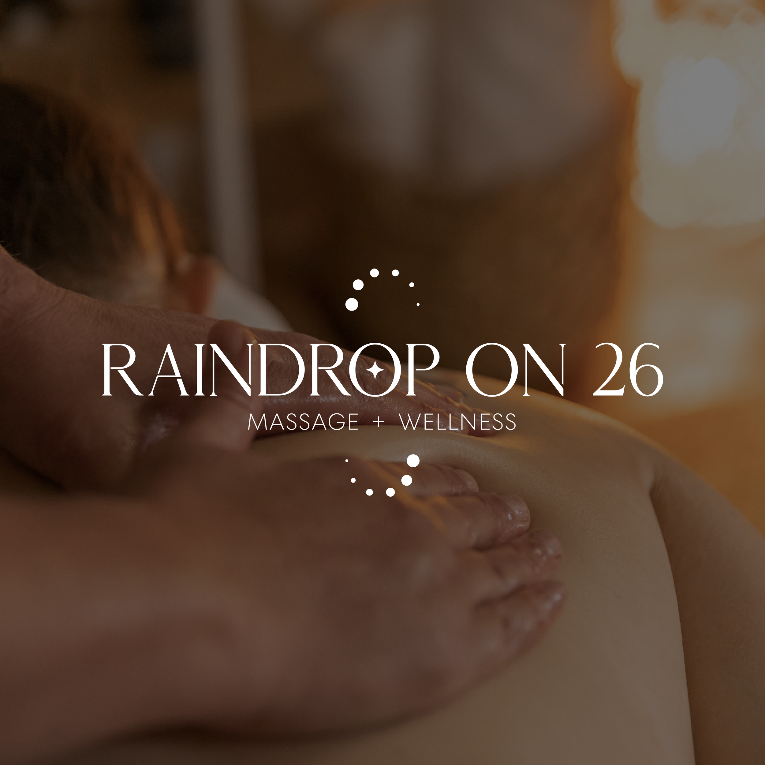

This was quite an interesting brand to build. By keeping the same brand name, we needed to find a more cohesive way to represent the business as a whole.
The feature all caps serif typeface has cuts throughout, and contrasts well with the smaller sans-serif secondary type. The addition of a star added another element to the brand - the use of shapes became an important part.
Bringing into reality the ‘raindrop technique’, the infinity drops were born. The Raindrop technique is one which uses drops of oils to heal in ways, no two ever the exact same size. It is a continual and ongoing process - hence the infinity drops. It became an integral part of the brand, and became a very useful pattern. It is, to date, one of my favourite brand elements created.
