Pyap Creek
Wine Label Design
PROJECT TYPE
Wine Label Design
YEAR
2023
DESCRIPTORS
Affordable, Connection, Movement
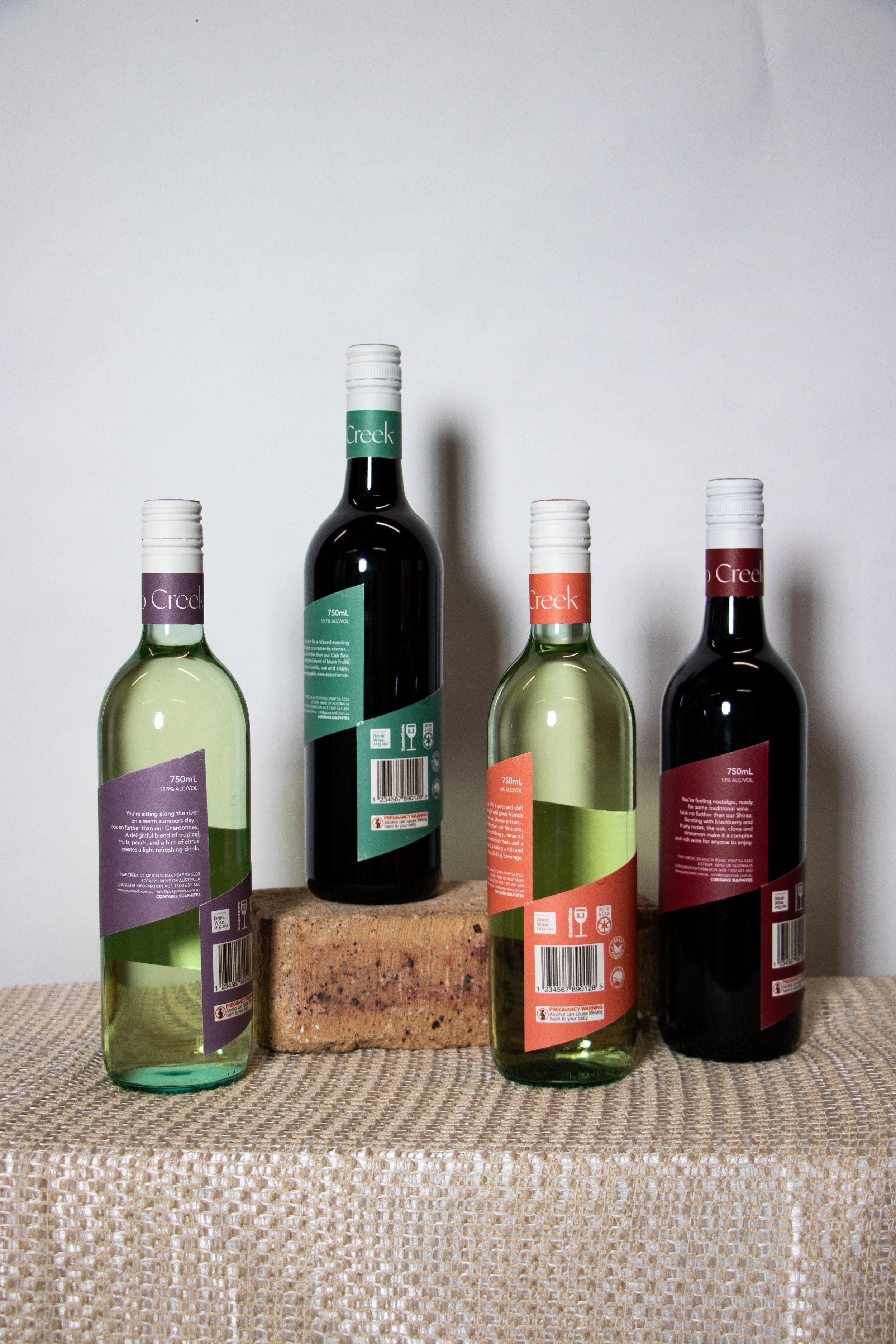
Pyap Creek is relatively new to the wine scene in the Riverland. Nestled on the mighty Murray River at Pyap, 10km out of Loxton, they pride themselves in sustainable, down to earth wines that remind you of home. Flavours you recognise, understand, connect with and love are all part of the way you feel ready to sit down and enjoy their small variety of wines. Mostly targeted at the younger demographic of drinkers, Pyap Creek pride themselves on providing a ‘high end’ feel on a budget. The wrap around labels stand as a point of difference, and further provide the illusion of movement / flow with the river and the connection of the labels at the back. It invites you to look at the whole bottle, rather than just the front label and moving on. The river on the front pays homage to the actual Murray River outline, specifically around the Pyap / Loxton area. The opaquer shapes around the river are different on every bottle, creating variety, but a sense of unity amongst the collection.
They make their wines affordable for everyone, but in a way that feels more expensive than other wines with the same price point. Whether you’ve moved out of home for further study, work, or just wanted a change in your life, there is no reason why a little something like this cannot remind you of your homeland. Adding to the ‘home’ feel, each wine has a setting on the back of the label, explaining the ideal situation to crack it open. Ranging from a quiet movie night, a relaxed evening with friends and family, or sitting along the river or beach on a warm summer’s day, Pyap Creek wines are ready for you to enjoy on any occasion… look no further!


