Little Leaps Speech Therapy
Brand Design | 2025
Redesign of the brand for a speech therapy brand in Loxton, Riverland.
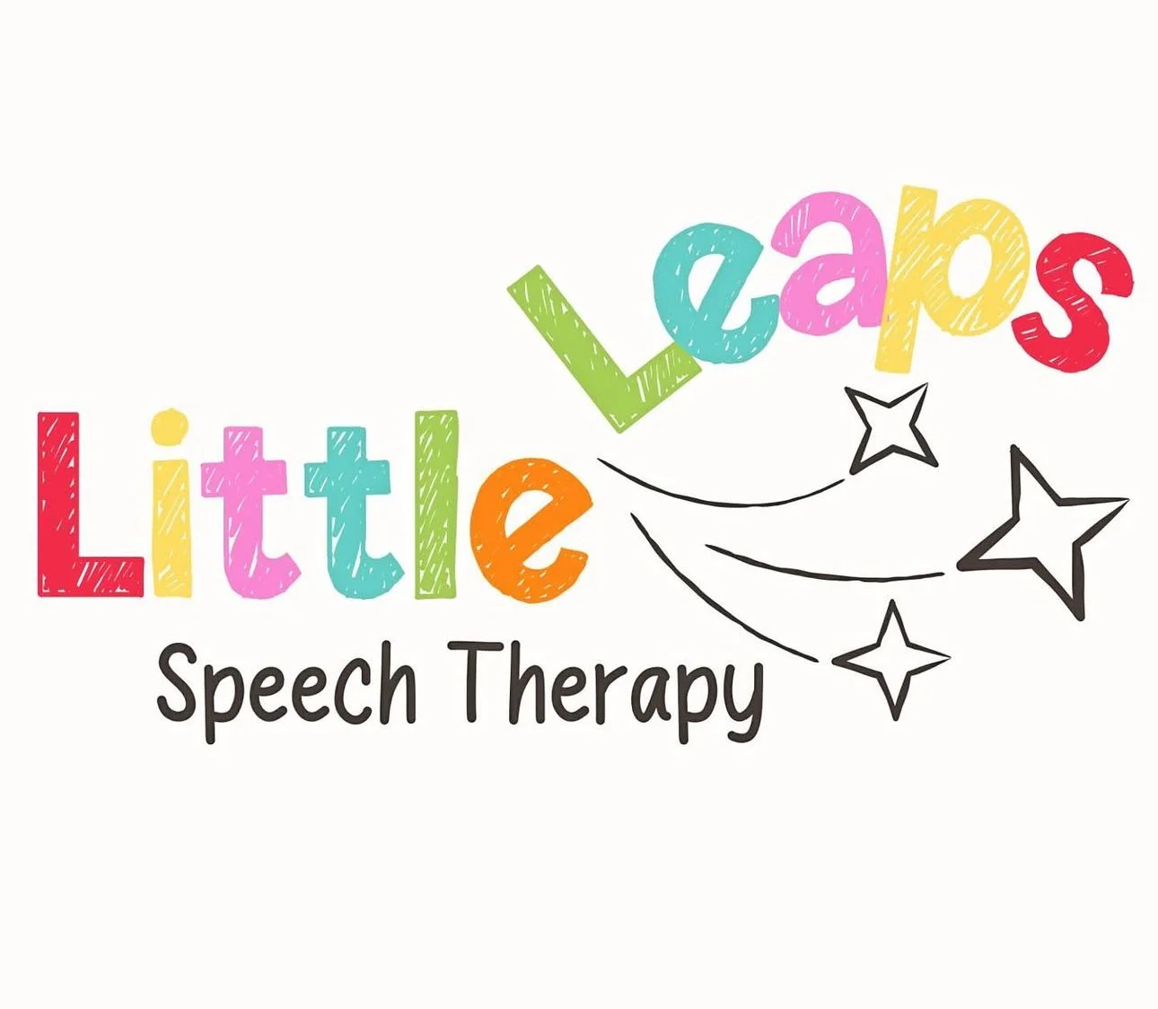
Previous Logo
THE BRIEF:
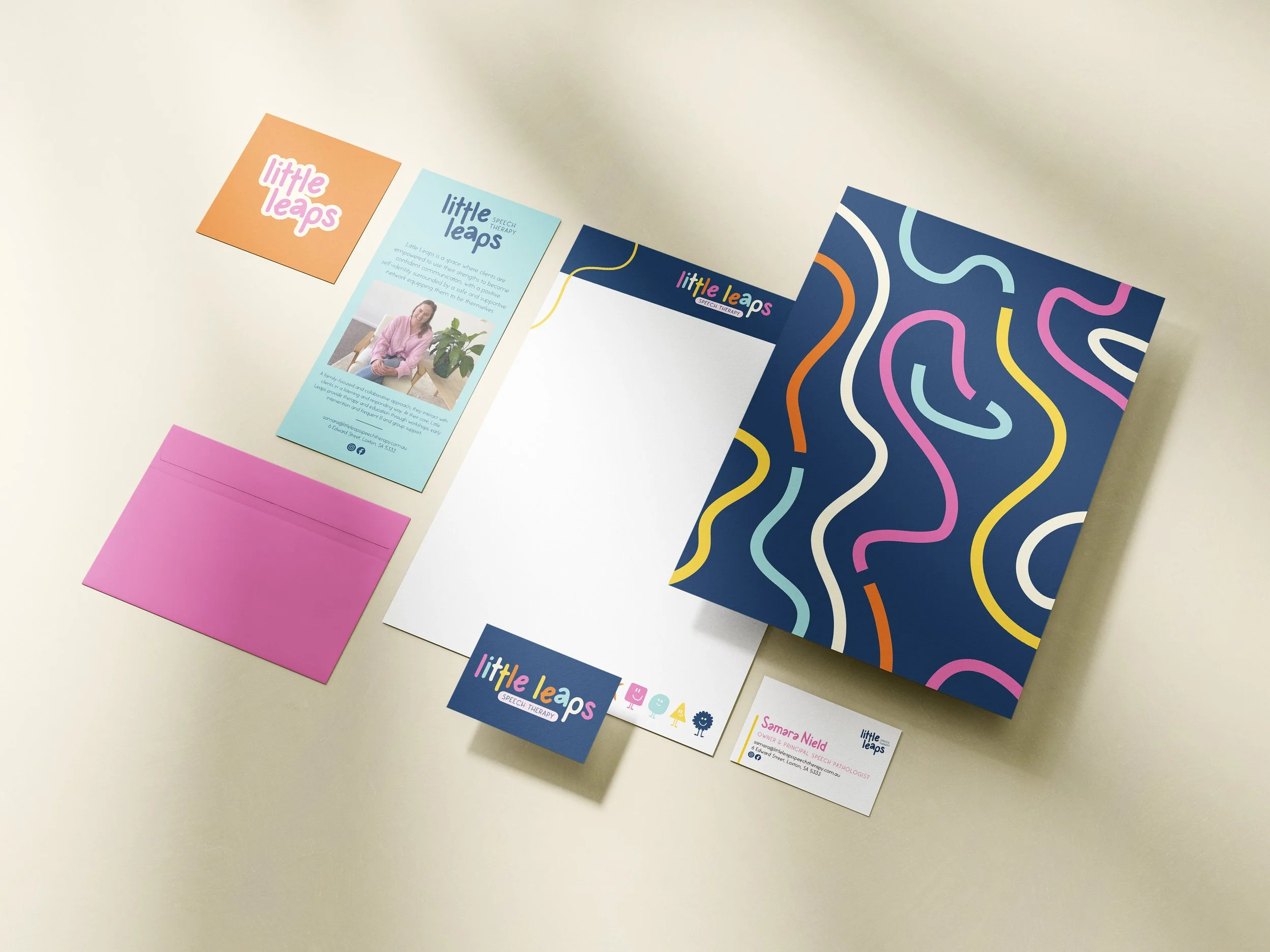
To create a cohesive visual identity, designed to be playful yet professional for families of young children, reflecting a play-based, colourful, calming, and sensory-supportive approach.
Little Leaps Speech Therapy is a small business, based in Loxton, South Australia, created as a way to offer local speech services. Through various forms of therapy (1:1 and group with children and parents), and education (workshops and social media), they are partnering with schools and learning centres - embedding themselves in the community.
They’re a collaborative, authentic, and creative business who provide services in different ways for families to meet their clients needs.
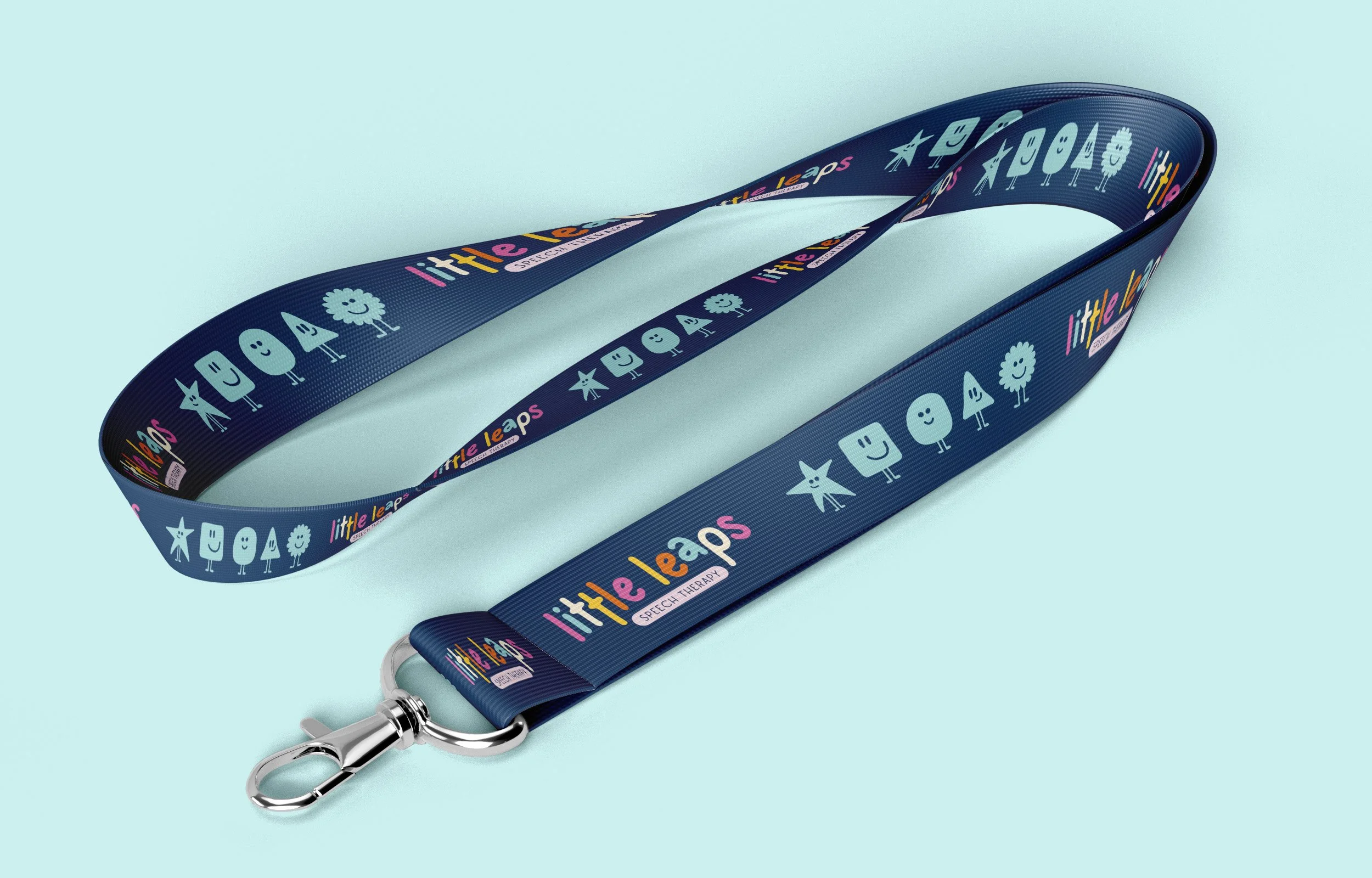
The brand completely reflects this - a carefully considered colourful and authentic suite. The slightly manipulated characters (elongated ‘t’, and altered ‘a’) aid in creating a consistent flow and connection in the logotype as a whole.
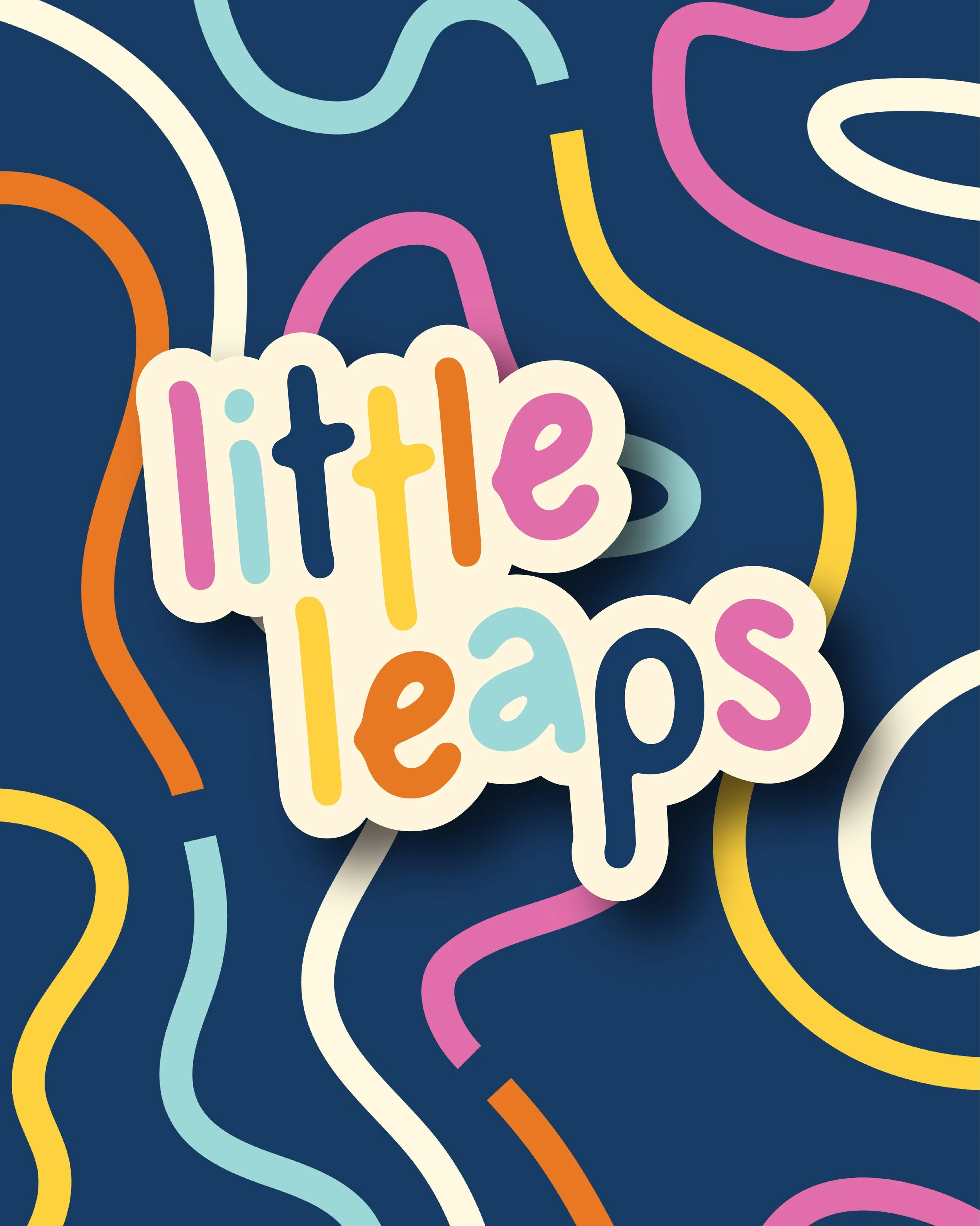
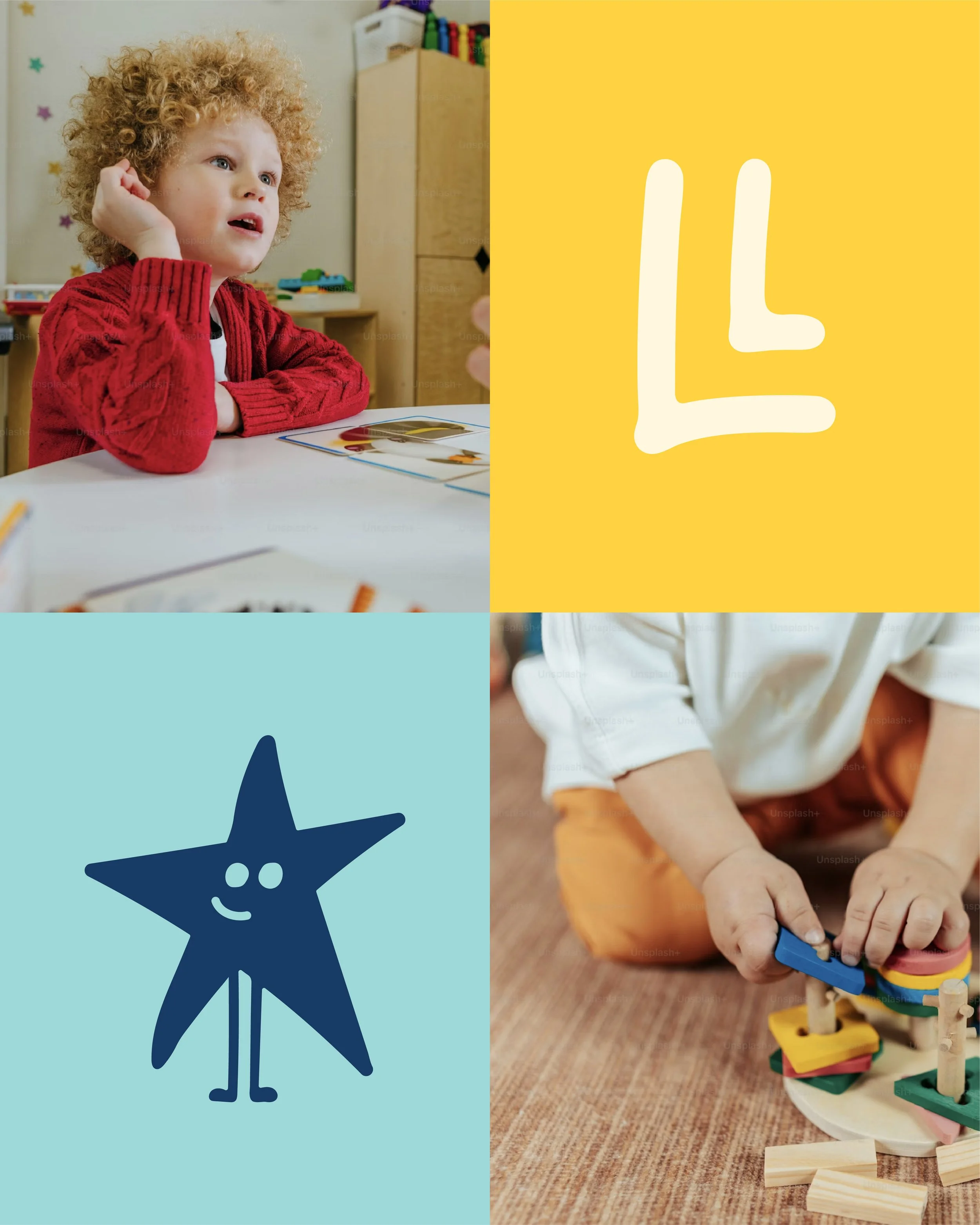
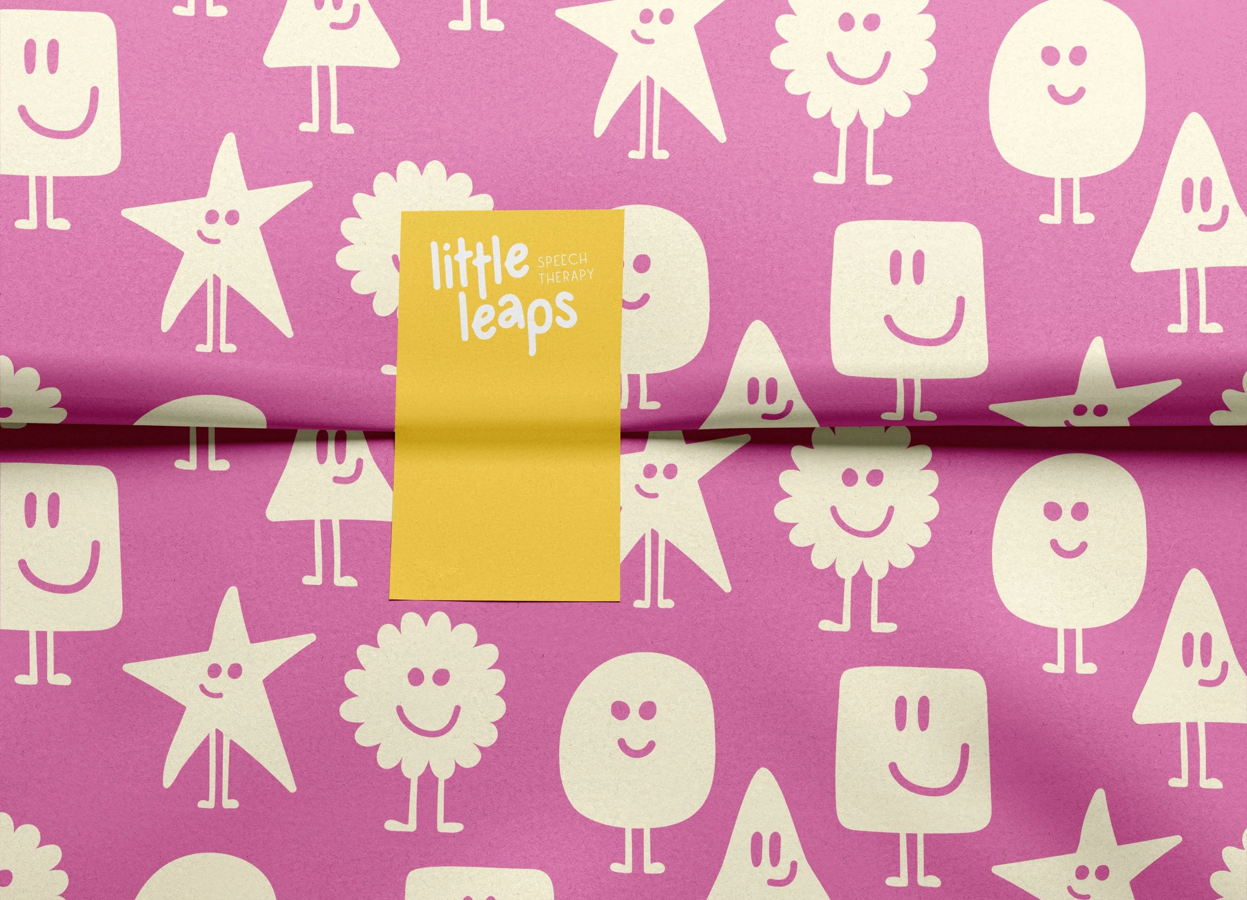
The logo suite plays on the wording of ‘little leaps’ and acts on it literally. There is no consistent baseline to the letters, creating little leaps throughout the main typeface.
A child-friendly and legible main typeface is contrasted with a thin, tall sans-serif to provide the element of professionalism and trust, targeted towards the parents.
It’s a brand with fun, curious, and authentic.